
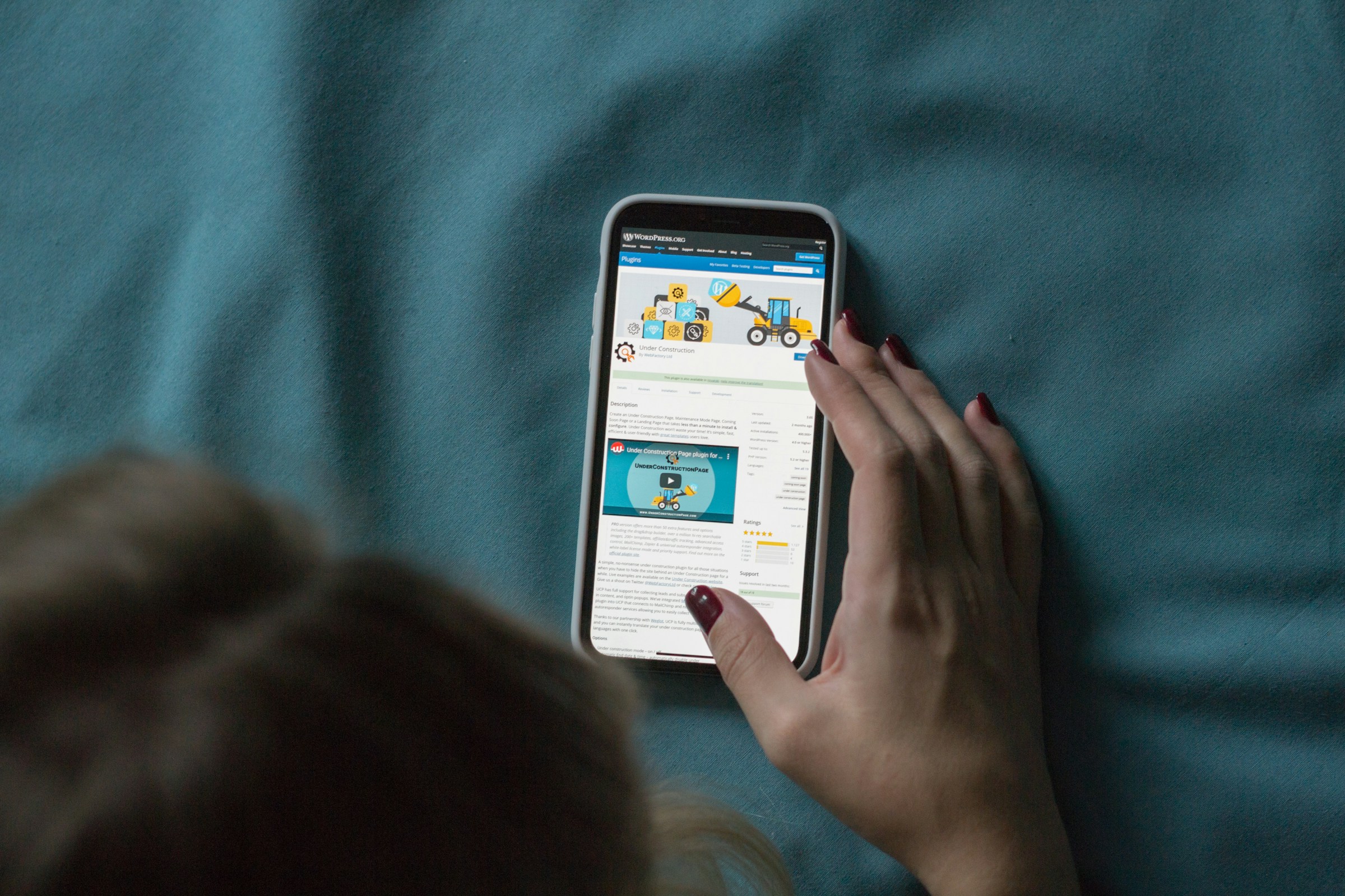
Most people who find your business online will do it on a phone. Mobile-first design just means building for that first, instead of treating it as a version to fix later. This article will explore why mobile-first design is crucial, its benefits, and how it can enhance your website's performance and user experience.
What is Mobile-First Design?
Mobile-first design is an approach where web designers start the design process with mobile devices in mind first, then progressively enhance the site for larger screens like tablets and desktops. This methodology ensures that the website is optimized for the smallest screen first, providing a seamless user experience across all devices.
Why Mobile-First Design Matters
Enhanced User Experience
Mobile-first design ensures that your website is user-friendly on all devices. Since mobile users often face challenges like slower internet speeds and smaller screens, a mobile-first approach prioritizes ease of navigation, fast load times, and accessible content. This leads to a better overall user experience, reducing bounce rates and increasing engagement.
Improved SEO
Search engines like Google prioritize mobile-friendly websites in their search results. A mobile-first design can significantly improve your site's search engine rankings, making it easier for potential customers to find you. According to Google's Mobile-First Indexing, sites that are optimized for mobile are more likely to rank higher in search results.
Faster Load Times
Websites designed with mobile-first principles tend to load faster on all devices. By optimizing for mobile from the start, you ensure that your site is lightweight and efficient, which is crucial for retaining visitors. Fast load times are a critical factor for user satisfaction and can also positively impact your SEO.
Increased Conversions
A well-designed mobile site can lead to higher conversion rates. Users are more likely to engage with and purchase from a site that provides a smooth, intuitive experience. By focusing on mobile-first design, you can create a more effective sales funnel and improve your business's bottom line.
Implementing Mobile-First Design
To implement mobile-first design effectively, consider the following steps:
Start with a Mobile Framework
Begin your design process with a mobile framework, such as Bootstrap or Foundation, which provides pre-built components optimized for mobile devices.
Optimize Images and Media
Use responsive images and media queries to ensure that images and videos load correctly on all devices. Tools like ImageKit can help you optimize images for various screen sizes.
Prioritize Content
Focus on the most critical content first, ensuring that it is easily accessible on smaller screens. Use a simple layout and avoid clutter to enhance readability and usability.
Test on Multiple Devices
Regularly test your website on various devices and screen sizes to ensure a consistent user experience. Tools like BrowserStack allow you to test your site on multiple devices and browsers.
Where mobile-first designs usually go wrong
The principle is easy to agree with and easy to abandon halfway through. The failures tend to look the same:
- Designing the desktop layout first and squeezing it. If the phone version is whatever was left over once the desktop version was finished, it will read like it.
- Tap targets that assume a mouse. Buttons and links need to be comfortably hit with a thumb, with enough space around them that the wrong one is hard to catch.
- Text that needs zooming. Anything under 16 pixels will get pinched and zoomed, and iOS zooms the whole viewport when a visitor focuses a form field smaller than that.
- Hiding content rather than prioritising it. Collapsing everything behind accordions is not mobile-first; it is desktop content in a smaller box. Decide what matters and lead with it on every screen.
- Testing by narrowing a desktop browser. That is not the same as a real phone on a real connection. Test on hardware.
Conclusion
Designing for the phone first is no longer a nice-to-have. By prioritizing mobile users, you can enhance user experience, improve SEO, increase conversions, and ensure faster load times. If you are interested in implementing a mobile-first design for your website, contact us today to get started.